How to Make a Webpage Responsive

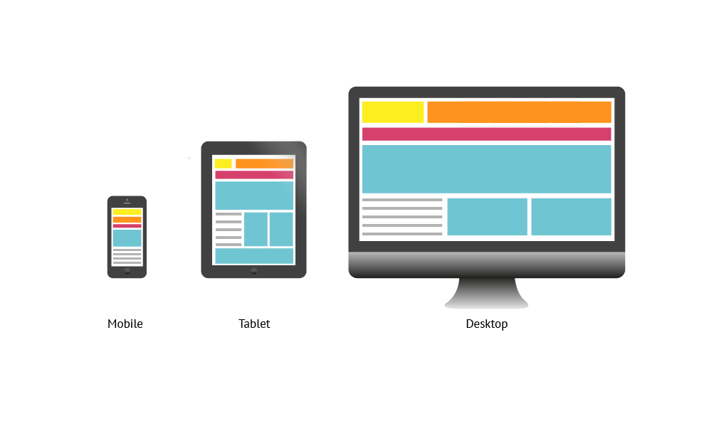
During the early years of the web, only a computer could access a website, but today we can access the web using a mobile phone, tablet, and even tv. All these devices have various screen sizes. Web developers must create websites that can adapt to any screen size. This article explores the ways we can make a website responsive.
What is responsiveness?
Responsiveness is a website's ability to adapt to the browser's viewport automatically. The layout of this blog on a mobile device is different from that on a laptop. You will notice that on a laptop device, the like, share, and Twitter buttons are displayed beside the article, while on a mobile phone, they appear below the article. That is because this website is responsive.
Think mobile-first
Mobile devices account for over 50% of global website traffic. What this means is that half of the internet users access the web through their mobile devices. In the US alone, over 40 million internet users are mobile-only. With this high number of internet users accessing the web through their mobile devices, it is advisable to build your website mobile-first before adapting your designs for other devices. With this approach, you can be sure that your website is fully responsive on mobile devices.
Do not forget the viewport meta tag
The viewport is the area of a web page visible to the user. The viewport does not have a fixed size but varies from one device to another. A desktop has a larger viewport compared to that of a mobile device.
The viewport meta tag is an HTML tag found in the <head> of an HTML document. It tells the browser how to render a webpage.
<head>
    …
    <meta name="viewport" content="width=device-width, initial-scale=1">
    …
</head>
width=device-width sets the width of the content to the width of the device. initial-scale=1 sets the initial zoom level when a user visits the page.
If you omit the viewport meta tag, mobile devices will display a webpage at desktop screen width, making it difficult to read.
Apply media query
A media query is a feature of CSS3 that tells a browser to modify a webpage if it fulfills a condition. Media queries help to achieve responsiveness by customizing webpages to support various screen sizes. They target a device property such as screen resolution, orientation, width, etc, then add styles that make it responsive.
The width media feature specifies the width of the viewport. It is one of the media queries you will certainly use to achieve responsiveness. This can be an exact number(for example 768px) or a range using min-width and max-width.
/* When the viewport is at least 700px and above */
@media screen and (min-width: 700px) {
  .element {
    /* Apply some styles */
  }
}
/* When the viewport is between 500px and 800px wide */
@media only screen and (min-width: 500px) and (max-width: 800px) {
  .element {
    /*Apply some styles*/
  }
}
Layout with CSS Flexbox and CSS Grid
Flexbox and grid layout are the easiest and most effective ways of creating a responsive layout without using positioning or float.
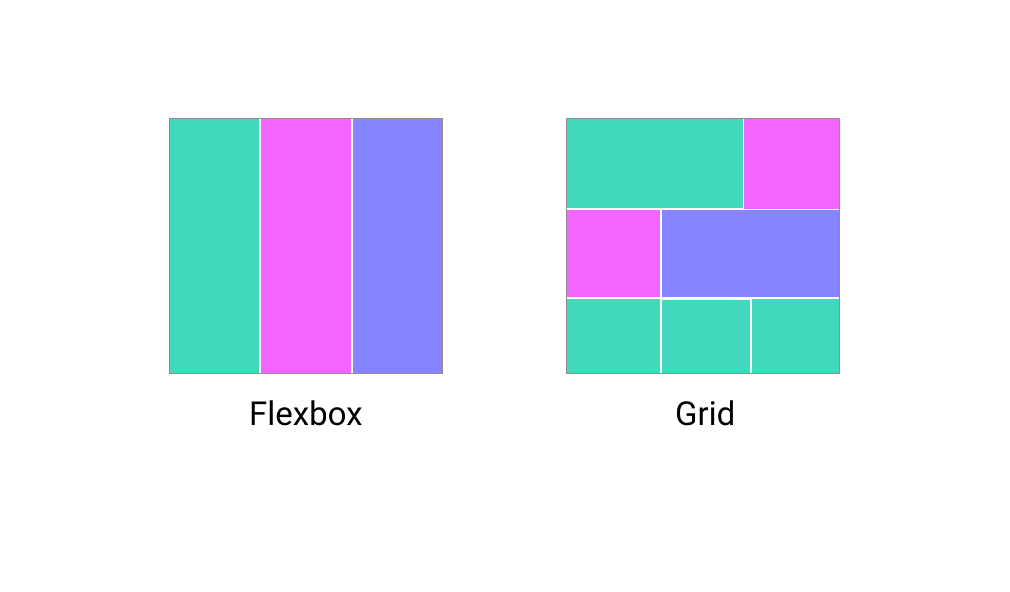
CSS Flexbox
Flexbox is a layout method in one dimension. With flexbox, you can arrange content in rows **or **columns. Flexbox is efficient because contents can grow to fill out space flex-grow or shrink to prevent overflow flex-shrink.
.container {
    display: flex;
}
CSS Grid
CSS Grid is a two-dimensional layout method for laying out items in rows **and **columns. CSS Grid aids in dividing a page into various segments. Grid layout is the most effective way of creating a responsive layout in CSS.
.container {
    display: grid;
}
Make images flexible
A picture is worth a thousand words
There is no doubt that images play a vital role on web pages. Images are appealing and easy to understand compared to blocks of text. A poorly laid out image can mess up the layout of a website preventing visitors from returning. The code snippet below makes images responsive.
img {
 max-width: 100%;
}
The code prevents images from exceeding the width of their container. You can apply this for video content too.
If you want to display a cropped version of an image for smaller screen sizes, an understanding of art direction is essential. You can learn more about this here
Use relative units
Units are vital when creating a responsive layout. There are several units in CSS, each one of them displays content differently. For example, pixel px is a fixed unit and it prevents users from altering the font size of a website while em and other relative units give users the freedom to adjust the font size from their device settings.
Relative units specify a length of an element in reference to another element. Relative units are practical in creating a scalable layout.
Examples of relative units and their description:
remis relative to the font size of the root element.emis relative to the font size of the parent element.vhis relative to 1% of the viewport's height.vwis relative to 1% of the viewport's width.
Conclusion
Responsiveness of a website on all screen sizes should be top priority when creating a website. The simple and effective steps in this article will certainly make your website responsive across all devices.


